Manufacturing KPI Dashboard: Enhance Operations for Businesses
Factory data gets messy fast when production, quality, downtime, and costs sit in separate reports. A manufacturing KPI dashboard brings manufacturing KPIs and production performance metrics into one clear view, so managers can spot issues before they turn expensive. In this guide, MOR Software will show you how dashboards work, which KPIs matter, and how Odoo can support better factory control.
What Is A Manufacturing KPI Dashboard?
A manufacturing KPI dashboard is a visual reporting tool that shows live factory data, core metrics, and performance signals in one clear view.
A KPI dashboard for manufacturing brings data from production lines, machines, and quality systems into a format that teams can read fast, often through charts, graphs, and tables.
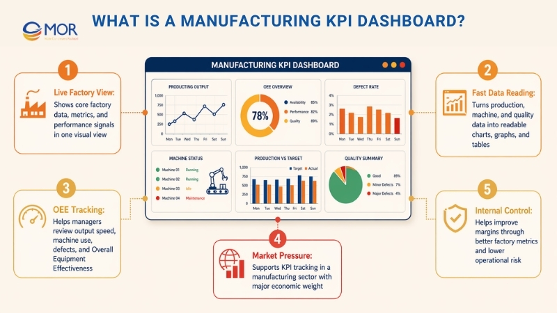
This kind of dashboard helps managers review factory data tied to output speed, machine use, defect levels, and Overall Equipment Effectiveness (OEE).
The manufacturing sector makes up more than 10% of the US economy and over 15% of global GDP. To keep pace in this tough field, companies need strong KPIs and clear metric tracking.
Most teams want more sales and a wider market share so profit can grow. Yet better margins can also come from smarter internal control, with less risk than heavy market growth. That is where the right factory metrics start to matter.
21 Manufacturing KPIs To Add To Your Dashboard In 2026
Starting with factory KPIs can feel like a lot at first. It gets easier when the list is split into clear, smaller parts. A manufacturing KPI dashboard works best when it tracks the numbers that explain real factory performance. These are 21 basic manufacturing KPIs your team can review when choosing each KPI for manufacturing operations.
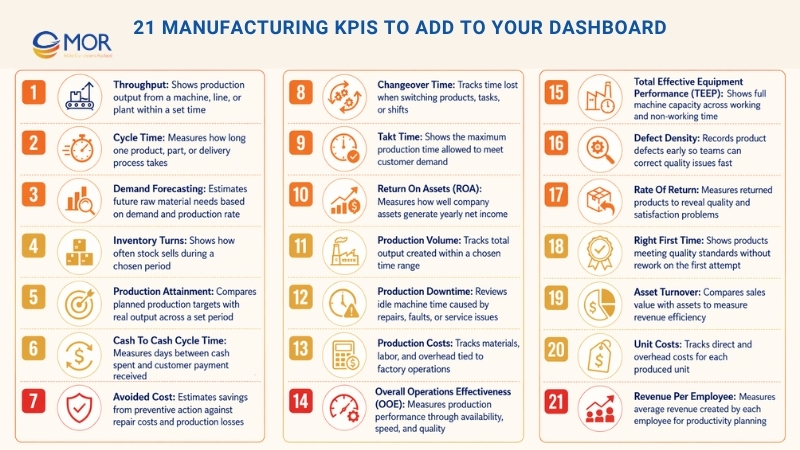
1. Throughput
Throughput = Number Of Units Produced / Time (Hour Or Day)
Throughput is one of the core factory metrics, and many teams treat it as one of the strongest production performance metrics. This dashboard metric shows how much a machine, line, or plant can produce within a set time.
2. Cycle Time
Cycle Time = Process End Time - Process Start Time
Cycle time looks simple, but a manufacturing KPI dashboard can use it in many useful ways. In a factory, it shows the average time needed to make one product. Sounds easy, right? It can get more detailed fast. This metric can track a full finished item, one part of that item, or the full path to delivery. Cycle time helps leaders review broad process speed and also find small slow points in each step.
3. Demand Forecasting
Projected Customer Demand = Raw Materials * Production Rate
This metric helps companies estimate how much raw material they need for future orders. Among KPIs for production manufacturing planning, demand forecasting can be harder to manage because outside factors can change fast.
4. Inventory Turns
Inventory Turns = Cost Of Goods Sold / Avg. Inventory
Inventory turns show how often stock is sold during a set period, which helps teams judge stock use and inventory performance. A low ratio can mean weak sales or too much stock, and a high ratio can point to strong sales or too little inventory.
5. Production Attainment
Production Attainment = Number Of Periods Production Target Met / Total Time Periods
This production metric checks output across a set period and shows the share of time when the team meets its target. It is also a useful KPI for production planning and control because it compares planned work with real output.
6. Cash To Cash Cycle Time
Cash To Cash Cycle Time = Inventory Sale Date - Inventory Purchase Date
This is a time-based manufacturing metric. It measures the number of days from the first cash spend on materials, stock, or plant needs until the business receives customer payment for finished goods.
7. Avoided Cost
Avoided Cost = Assumed Repair Cost + Production Losses - Preventive Maintenance Cost
This does not mean a company can skip bills and keep all the money. Avoided cost estimates how much money the business protects after spending money in the right place. Sounds a bit odd, right? A common case is planned machine learning development service compared with the repair cost of a breakdown, plus the lost value from the production stop.
8. Changeover Time
Changeover Time = Net Available Time - Production Time
At a basic level, changeover time shows how long it takes to move from one task to the next. In a factory, it often means the time lost when a line changes from one product to another. It can also show time lost during a shift handover.
9. Takt Time
Takt Time = Net Available Time / Customer’s Daily Demand
This manufacturing KPI helps teams schedule production work or decide whether a customer order can be accepted. Takt time shows the longest allowed time for making a product and still meeting the customer deadline. The word comes from “taktzeit,” a German term linked to cycle time. It may sound close to cycle time, but the two metrics are not the same.
10. Return On Assets (ROA)
ROA = Net Income / Avg. Total Assets
You may think this metric sounds more like finance than manufacturing. That is true. Still, money metrics matter as much as factory metrics because a business must earn profit to survive. ROA shows how well the company uses its assets, or money. It divides yearly net income by total assets, including fixed assets and working capital.
11. Production Volume
A manufacturing KPI dashboard can track total production volume and show how much output your process can create. This means keeping a clear record of all products made within a chosen time range.
12. Production Downtime
Review maintenance logs and repair steps to find where work can improve. The aim is to lower the time when machines sit idle because of repairs, faults, or service issues.
13. Production Costs
Track every cost tied to factory work, including materials, labor, and overhead. This helps with budgeting and shows where a production line may have room to cut spend.
14. Overall Operations Effectiveness (OOE)
Study total production performance through availability, speed, and quality. OOE helps teams find where operations work well and where they need better control.
15. Total Effective Equipment Performance (TEEP)
Track the full value of your machines across working and non-working time. TEEP helps teams understand the true capacity of equipment across all shifts, including repair time and other production pauses.
16. Defect Density
A manufacturing KPI dashboard can record how often product defects appear as soon as they happen. Defect density helps teams find quality problems early and make corrections before product trust drops.
17. Rate Of Return
Measure the share of products customers send back, since returns can reveal product quality and customer satisfaction issues. This metric helps teams learn why returns happen and plan ways to lower them.
18. Right First Time
A manufacturing KPI dashboard can show the percentage of products that meet quality standards on the first try without rework. This KPI reflects how accurate and reliable the production line is.
19. Asset Turnover
Check how well your company uses assets to create revenue. This ratio compares sales value with asset value and shows whether resources are helping the business earn income.
20. Unit Costs
Track and adjust the cost of making each unit over time. This includes direct costs, like materials and labor, plus shared overhead costs, so pricing and margins stay under control.
21. Revenue Per Employee
Measure the average revenue each employee creates, which gives leaders a view of workforce output and productivity. This metric can show the return from people-related investment and guide future workforce planning. These are only the basic KPIs used across manufacturing. A company should go further when it needs a deeper view of how production really works.
Most Common Types Of Manufacturing KPI Dashboard
A manufacturing KPI dashboard can take many forms, as each factory team needs a different view of its work. The most common manufacturing KPI dashboard examples cover production, supply chain, and quality control. These dashboards turn factory data into simple views that help teams manage work, resources, and results.
Building these dashboards needs an analytics tool that can connect data from IoT devices, ERP systems, and Manufacturing Execution System (MES) platforms. Strong links between these systems give teams the data they need to raise output, control cost, and spot issues early.
With that in mind, let’s look at the main dashboard types and how each one supports better decisions across factory work.
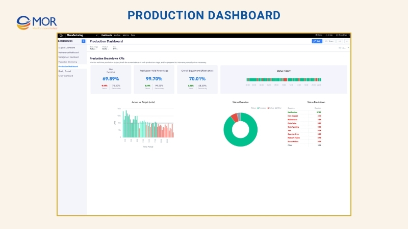
Production Dashboard
In a factory, a production dashboard tracks output and work speed through KPIs that show live performance. A manufacturing production KPI dashboard often includes OEE, which checks availability, speed, and quality to show how well equipment performs. Units produced per hour show real output and help teams find bottlenecks. Downtime data, including how often machines stop and how long they stay down, points to repair needs and lost time. Defect rate tracks the share of faulty items and helps protect product quality. Machine use shows whether equipment is being used well. When production kpis sit in one view, teams can improve output, cut waste, and keep quality steady.
Maintenance Dashboard
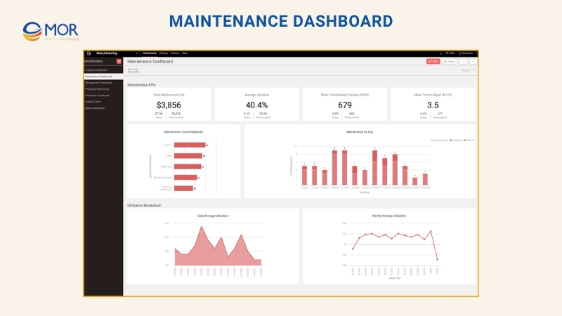
This dashboard tracks equipment health and warns teams about possible machine failure, which helps cut downtime and plan repair work better. Mean Time Between Failures (MTBF) shows machine reliability through the average time between breakdowns, and Mean Time To Repair (MTTR) shows how fast a machine returns to use after it fails. Machine condition monitoring reads live sensor data to find strange patterns before they turn into bigger problems. Planned versus unplanned maintenance use helps teams balance routine service with urgent repair work and avoid costly stops. Maintenance cost tracks spend on repair work, people, and spare parts, so budgets stay under control. These KPIs help teams move away from reactive repair and toward predictive maintenance, which can extend machine life and raise output.
Quality Dashboard
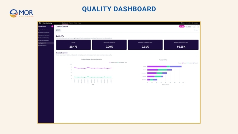
A quality dashboard is another common factory view, built to track defects, support quality control, and help teams meet rules and customer standards. Defects Per Million Opportunities (DPMO) shows broad defect levels and makes quality trends easier to see. Customer complaint rate shows product issues that buyers report, so teams can fix repeat problems. Comparing compliant and non-compliant units helps teams check quality results in real time. Root cause analysis shows where defects start, making it easier to correct small issues before they spread. Quality achievement rate (%) measures how many products meet standards, which makes quality KPIs in manufacturing easier to track and report.
Logistics Dashboard
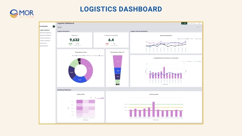
Logistics dashboards help teams watch stock levels and supply chain flow through the manufacturing KPI dashboard, so materials move at the right pace and cost stays in check. Inventory levels, including minimum, ideal, and critical stock, help prevent too much stock or sudden shortages. Inventory turnover rate shows how fast stock is used and refilled, which helps manage storage and cash. Supplier delivery punctuality shows whether suppliers meet promised dates, lowering the risk of production delays. Transportation cost shows shipping spend and helps find ways to cut waste. Unplanned stockout rate reveals surprise shortages that can slow production and hurt customer trust. These KPIs give manufacturers tighter control over the supply chain.
Safety Dashboard
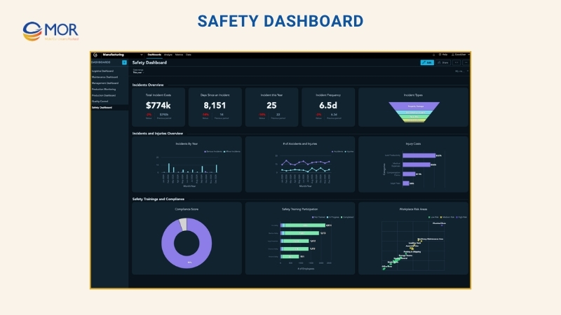
Safety dashboards help factories protect workers through metrics that track incidents, risks, and rule compliance. The number of accidents and injuries gives a live view of workplace events and shows patterns that need attention. Compliance with safety standards shows whether teams follow outside rules and internal safety policies, which lowers legal and operating risk. Injury-related costs show the money lost to medical care, downtime, and lower output. Employee safety training programs track who joined training and how well it worked, so workers have the right knowledge for safe work. Workplace risk areas show unsafe zones and help teams act before accidents happen. A safety dashboard supports a safer workplace and a stronger safety culture.
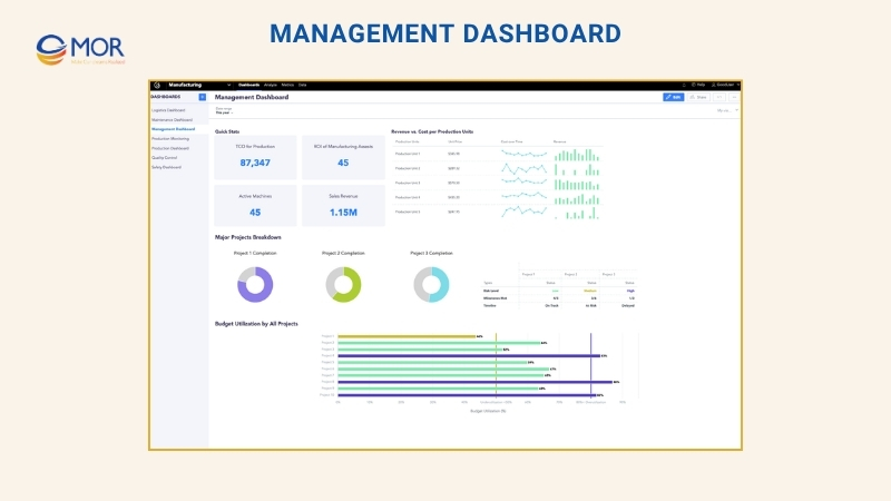
Management Dashboard
A management dashboard tracks factory finance and high-level metrics, giving leaders a clear view of cost, profit, and project status. Total Cost Of Ownership (TCO) for production helps leaders see long-term costs tied to equipment, maintenance, and energy. ROI of manufacturing assets shows whether money spent on machines and plant assets creates strong returns. Revenue versus cost per production unit shows margin health by comparing income with production spend. Budget use percentage shows whether teams spend too much or leave money unused. Key project status helps leaders track timelines, milestones, and progress against business goals.
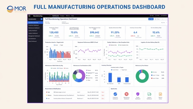
Full Manufacturing Operations Dashboard
A full manufacturing operations dashboard brings core metrics from production, quality, maintenance, logistics, and management into one view. Its goal is simple: keep factory work steady, visible, and easier to control. When all data and KPIs sit in one dashboard, leaders get a joined-up view of factory performance. Many manufacturing KPI dashboards use this model because it helps teams spot trends, find weak points, and make decisions that raise output and profit.
What Makes The Best Manufacturing KPI Dashboard
Many manufacturing metrics are treated as standard across the industry. That does not mean every company should use all of them. Some will fit your process, and some will not. You may even need a metric that does not yet exist in a standard list. When you build a manufacturing KPI dashboard, your manufacturing dashboard KPI choices should follow a few simple rules.
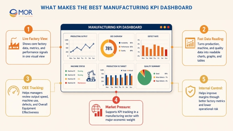
- Every KPI needs a clear goal. What result are you trying to reach? Can the team reach it? What time range will you use for that goal? Set firm details that make the target easy to understand. The goal must be number-based, not based on opinion.
- Your team must be able to track progress toward the goal in a fair way. That means collecting data and reading it with the same method each time. This leads to the next point.
- Data matters. Each KPI needs a clear data source and a fixed process for how that data is collected or measured. Nothing should be left open to guesswork.
- Reporting data matters just as much as gathering it. Different factory KPIs need different reporting cycles. Most teams report weekly or monthly, often through a manufacturing reporting software tool.
After covering basic factory KPIs and what makes a useful metric, teams can move into lean manufacturing KPIs and deeper performance tracking.
Create Your Own Manufacturing Dashboards With Odoo
An Odoo manufacturing KPI dashboard turns raw shop-floor data into live views your team can use. Instead of opening separate reports for work orders, machine time, scrap, and quality issues, managers can check production health from one place.
Teams can build these dashboards with Odoo’s built-in Reporting and Spreadsheet tools, add Odoo Apps Store modules, or work with an implementation partner. MOR Software helps manufacturers build and connect systems around real work, including production, reporting, Odoo integration, and long-term support. That makes KPI dashboard manufacturing work more practical for teams that need more than a basic report.
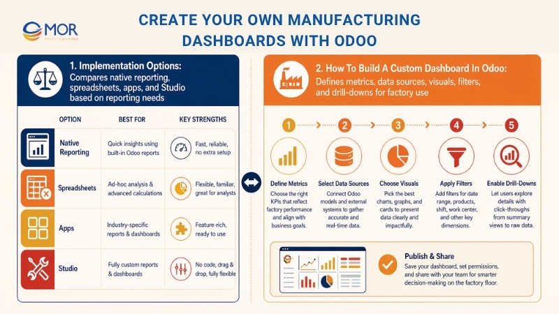
Implementation Options
Your technical skills, data needs, and reporting goals will guide the best Odoo dashboard setup. Some teams may start with a free manufacturing KPI dashboard excel template, then move to live Odoo reporting once factory data becomes more complex.
Method | Best For | Key Features |
Native Odoo Reporting | Standard users | Built-in pivot and graph views; simple dashboard pinning. |
Odoo Spreadsheets | Deeper analysis | Live data sync with spreadsheet-style formulas and flexible views. |
Third-Party Apps | Stronger visuals | Dashboard modules can add cleaner charts, better layouts, and faster setup. |
Odoo Studio | Custom data | Lets teams create custom fields, views, and workflows without code. |
How To Build A Custom Dashboard In Odoo
A useful dashboard starts with one question: what should the factory manager check first each morning? Once that answer is clear, the setup becomes easier. Odoo can pull data from manufacturing orders, work centers, inventory, and quality checks, then turn it into charts for output, downtime, scrap, and delivery risk.
- Define Your Metrics: Pick the 5-8 most useful KPIs for your process, including OEE, cycle time, scrap rate, work order status, and downtime.
- Configure Data Sources: Check that your Manufacturing Orders, Work Centers, and Quality modules capture time, materials, labor, and defects in the right way.
- Create Visualizations: Open a list or pivot view in the Manufacturing app, apply filters, then use the “Insert in Spreadsheet” or “Add to Dashboard” action.
- Set Up Filters: Use date filters like “This Week”, “This Month”, or “Last 30 Days” so the data stays fresh.
- Enable Drill-Downs: Keep charts interactive, so managers can click a scrap bar, delayed order, or downtime record and see the issue source.
A dashboard should not turn into a crowded wall of numbers. It should help your team find the issue, trace the cause, and act faster. That may mean a simple work center view for supervisors, a cost view for finance, and a delay report for leadership.
MOR Software can support your Odoo setup from KPI planning to module setup, custom fields, workflow design, and system integration. If your factory data still sits across spreadsheets, machines, and manual reports, contact MOR Software to build an Odoo manufacturing KPI dashboard that matches the way your factory runs.
Conclusion
A manufacturing KPI dashboard gives business leaders a clearer way to track output, downtime, quality, costs, and team performance. The right setup helps managers act faster, compare factory results, and build better production plans for 2026. For manufacturers using Odoo, the dashboard can become a daily control room for real operations. If your data still lives in spreadsheets and manual reports, contact MOR Software to build a dashboard that fits your factory workflow.
MOR SOFTWARE
Frequently Asked Questions (FAQs)
What is a manufacturing KPI dashboard?
A manufacturing KPI dashboard is a visual screen that shows key production data in real time. It helps teams track output, downtime, quality, and costs in one place without switching between reports.
Why do factories use a manufacturing KPI dashboard?
Factories use a manufacturing KPI dashboard to spot problems early and keep production on track. It gives managers a clear view of what is working and what needs attention right away.
Which KPIs should be included in a manufacturing KPI dashboard?
Common KPIs include OEE, cycle time, throughput, defect rate, downtime, and unit cost. The exact list depends on your production process and business goals.
How often should a dashboard be updated?
Most dashboards update in real time or every few minutes. For some reports, daily or weekly updates are enough, especially for financial or long-term tracking.
Who should use a manufacturing KPI dashboard?
Supervisors, plant managers, and executives all use it. Each role needs a slightly different view, from shop-floor metrics to financial performance.
What tools are used to build these dashboards?
Companies often use ERP systems, BI tools, or custom software. Some teams also use spreadsheets for smaller setups, though they lack real-time data.
How many KPIs should be on one dashboard?
Keep it simple. Most teams track five to eight KPIs on one screen. Too many numbers can make it hard to focus on what really matters.
Can a manufacturing KPI dashboard help reduce costs?
Yes. It highlights waste, delays, and low-performing machines. That makes it easier to fix issues and control production expenses.
What is the difference between a KPI and a metric?
A metric is any measurable value. A KPI is a key metric tied to a business goal, like improving output or lowering defects.
How do you start building a dashboard for manufacturing?
Start with your main goals, then pick a small set of KPIs. Connect your data sources, create simple visuals, and refine the dashboard as your team uses it.
Share


Rate this article
0
over 5.0 based on 0 reviews
Your rating on this news:
Name
*Email
*Write your comment
*Send your comment
1